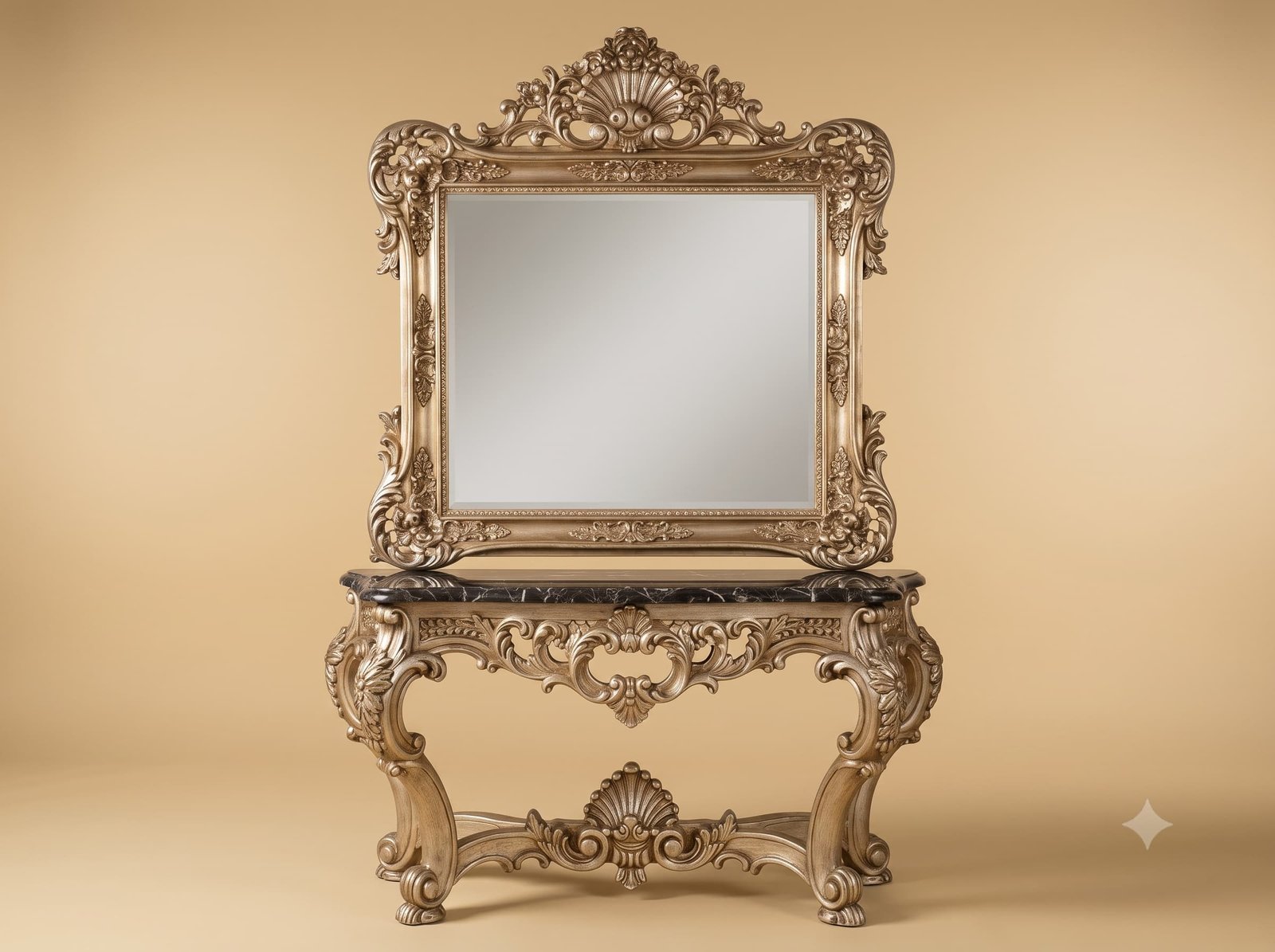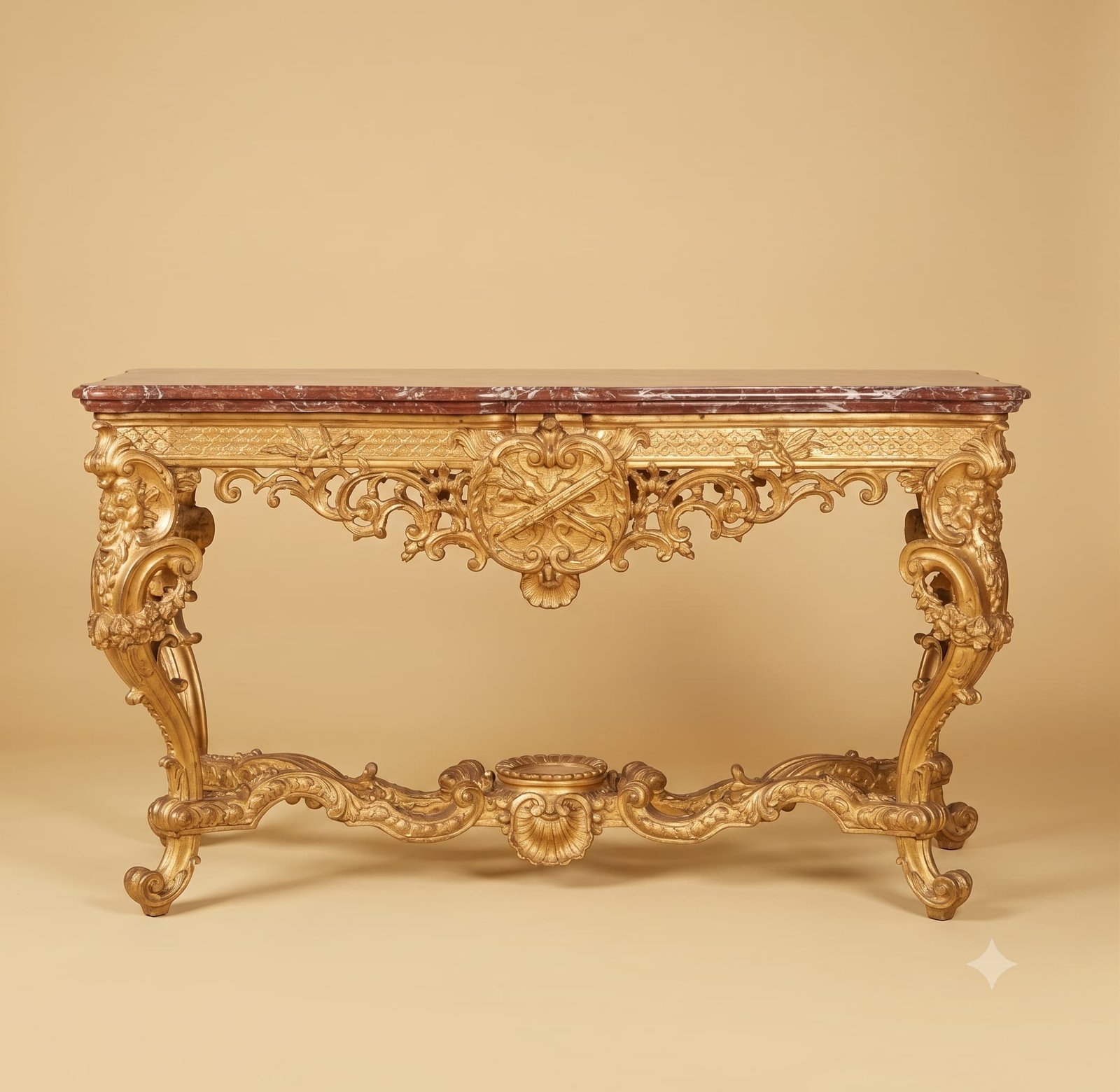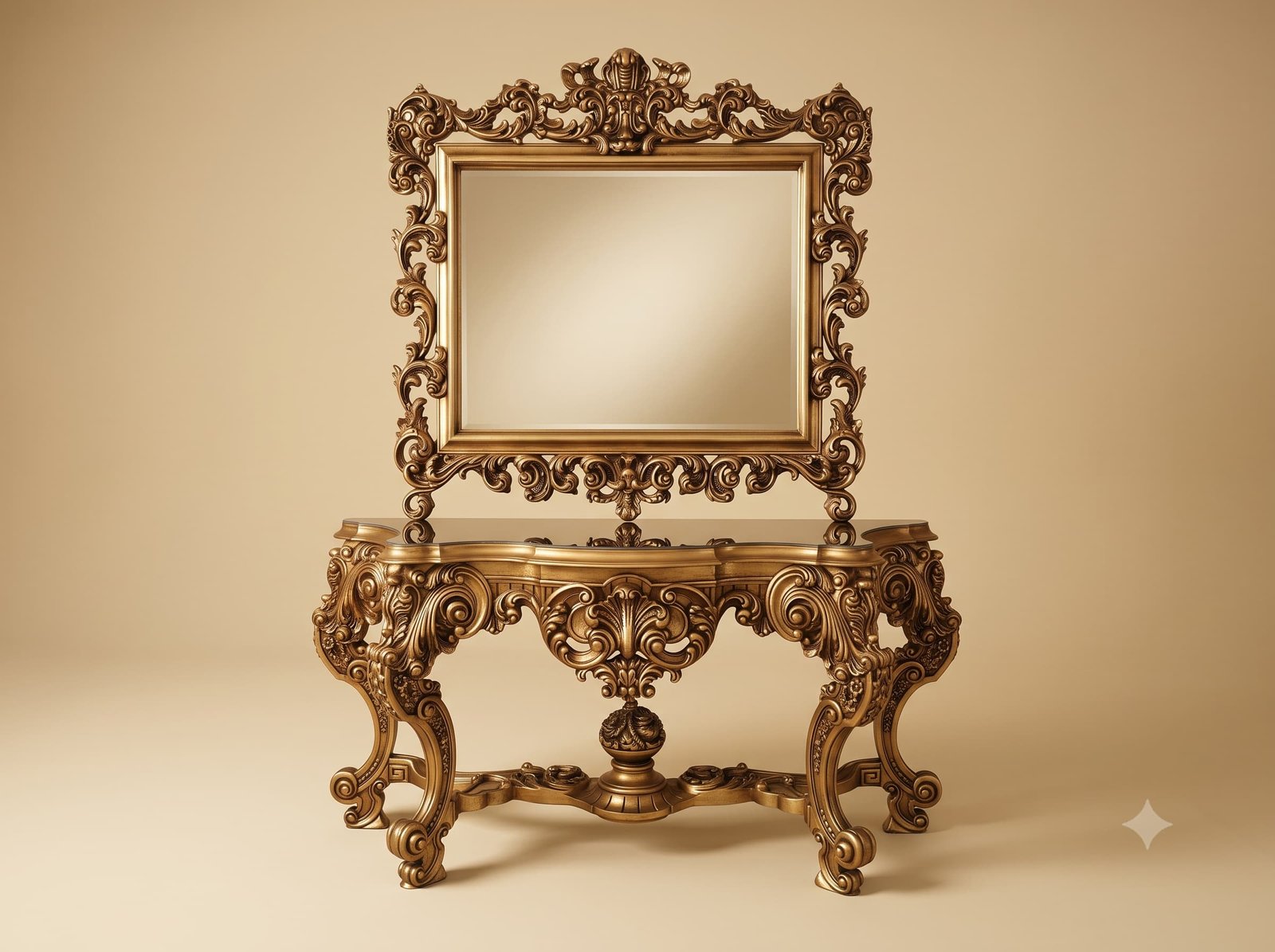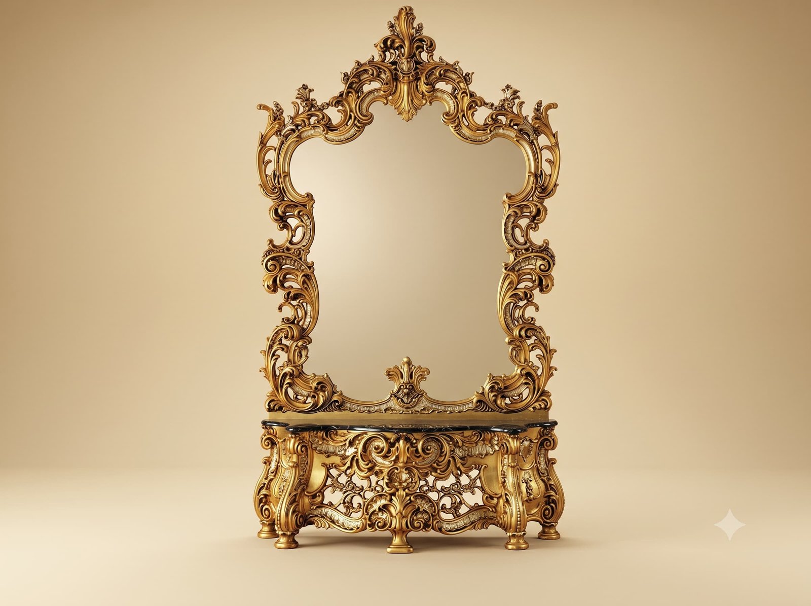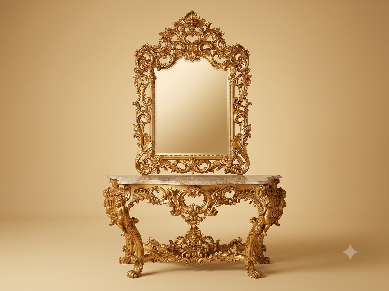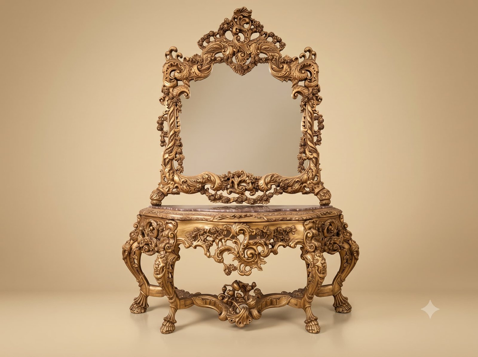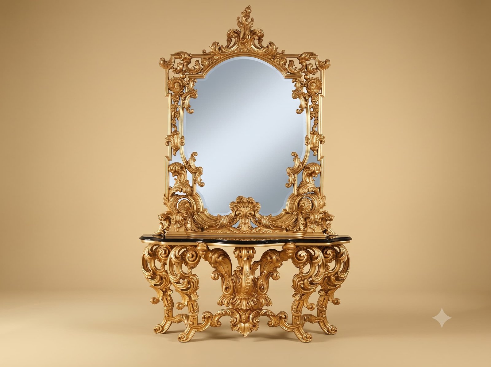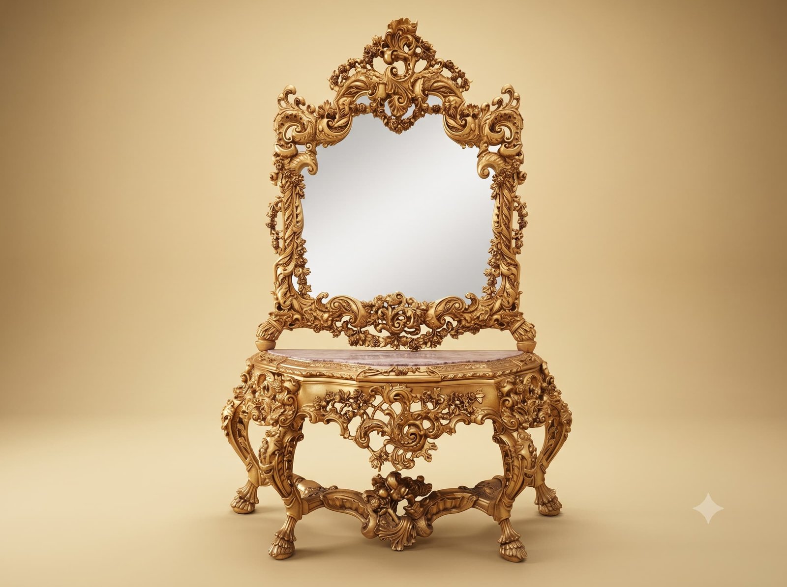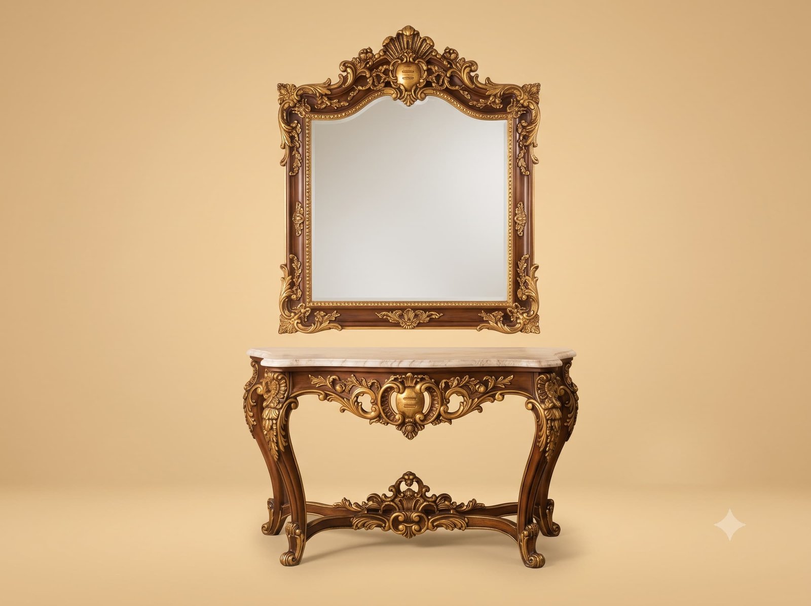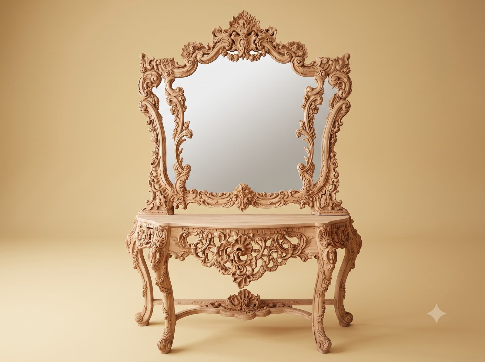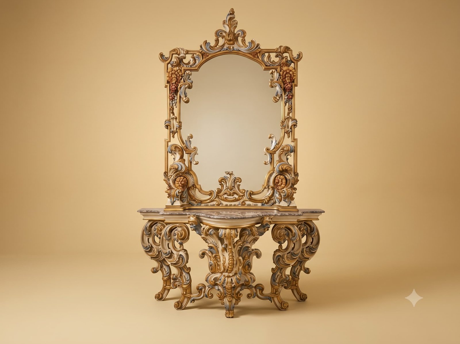
Painting carved work is a different discipline from gilding it, and the mistake that ruins it is assigning colour by motif - all the leaves green, all the flowers pink. Done that way, a carved surface turns into a coloured drawing and the modelling underneath disappears.
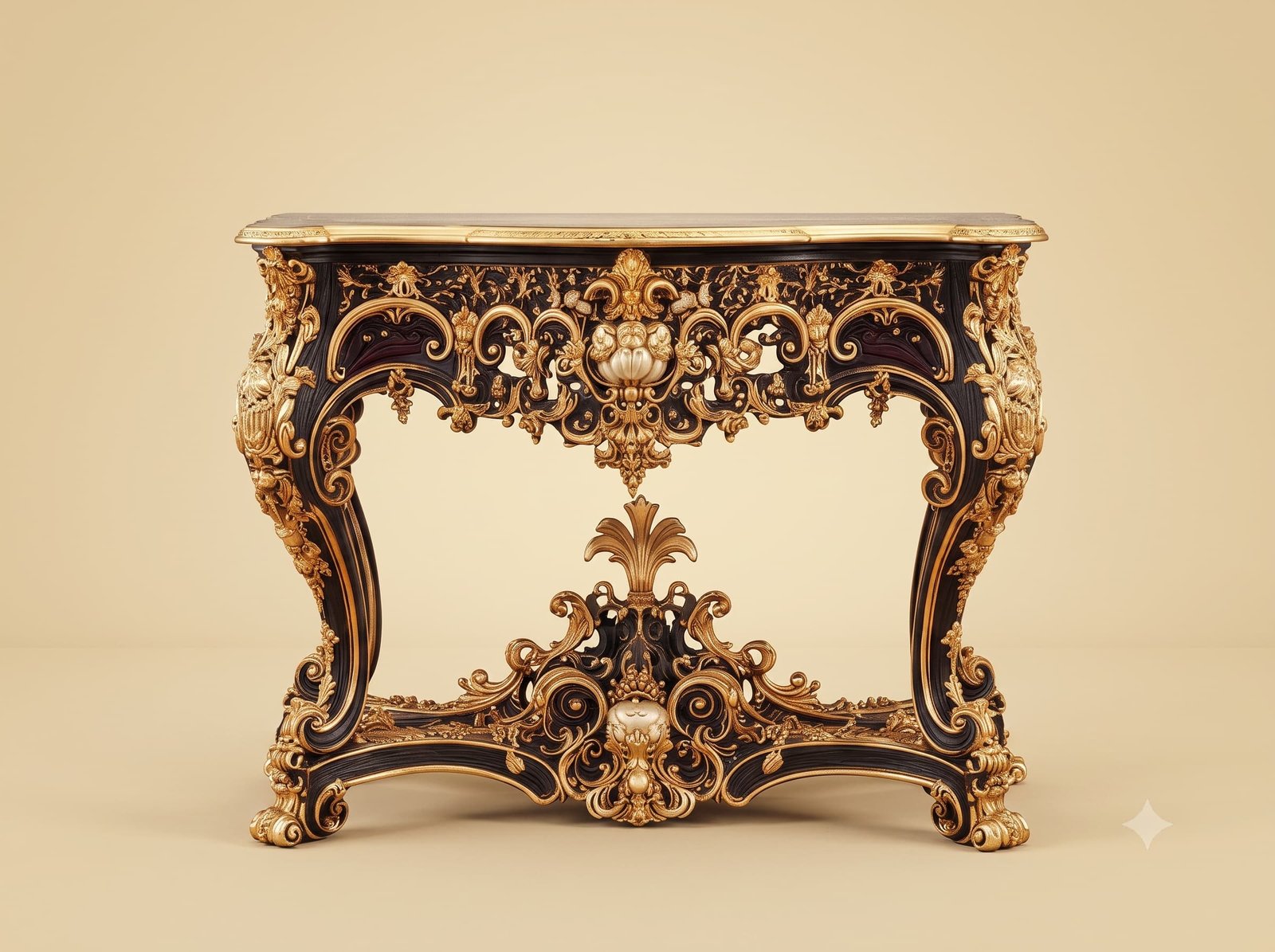
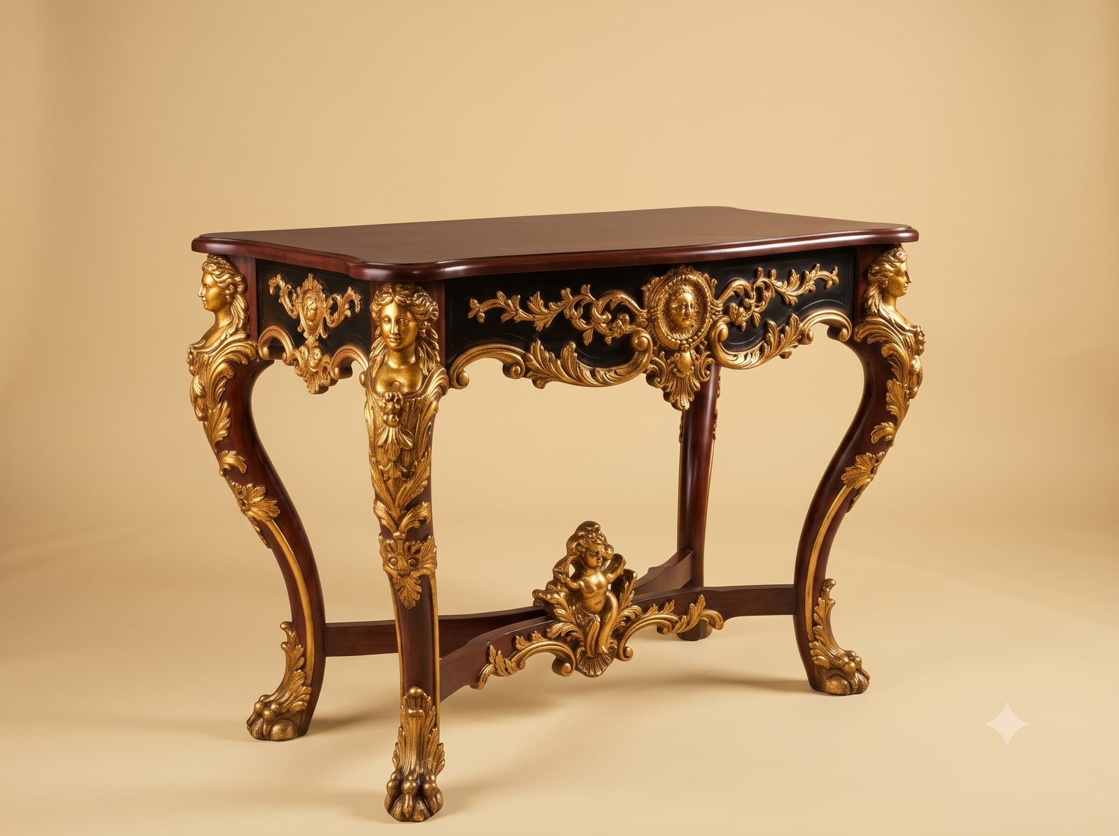
Our master Indian artisans assign colour by depth instead. The pale ground goes on everywhere first. The deepest recesses then take the coolest, greyest tone, because in life the deepest hollows are the least lit. The middle planes carry the body colour. And gold is reserved for the topmost surfaces only - the ridge of a scroll, the crest of a leaf, the high point of a shell - because those are the surfaces light would actually strike.
The result is that the colour reinforces the carving rather than competing with it. Step back and you do not read paint; you read depth.
One further rule keeps a painted piece calm: one tone must clearly dominate, holding most of the surface, with everything else appearing in small quantities. Split the surface evenly between three colours and the carving is lost inside the pattern.
 Ask Price On WhatsApp