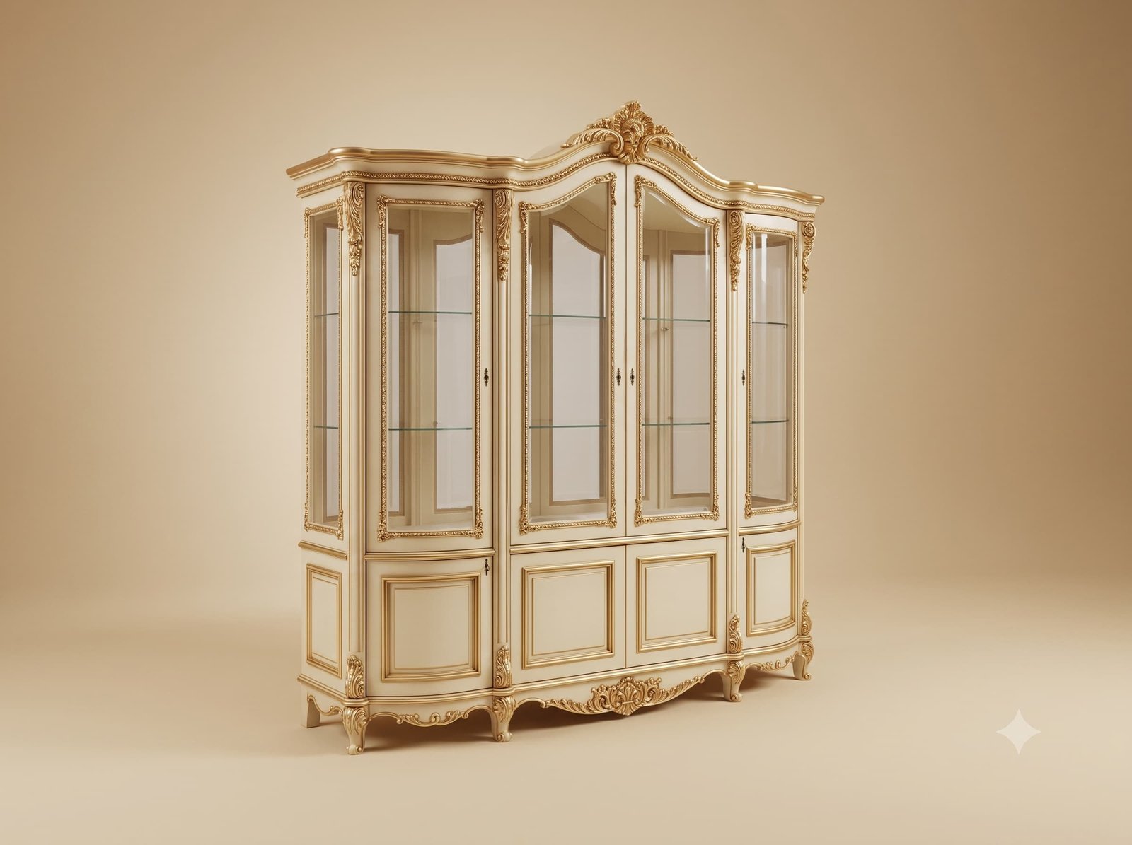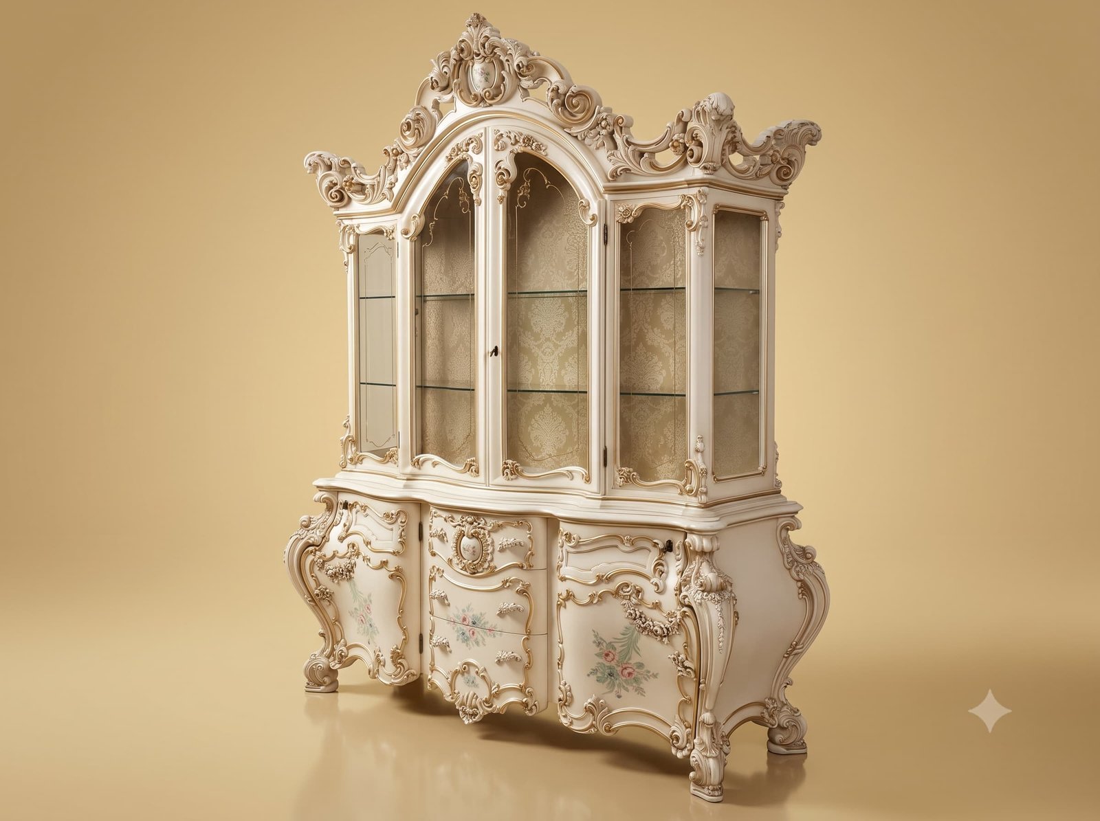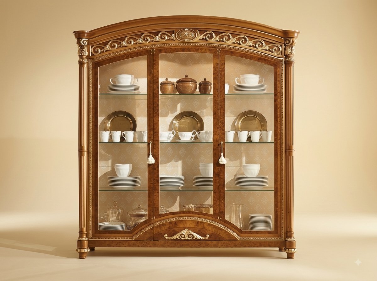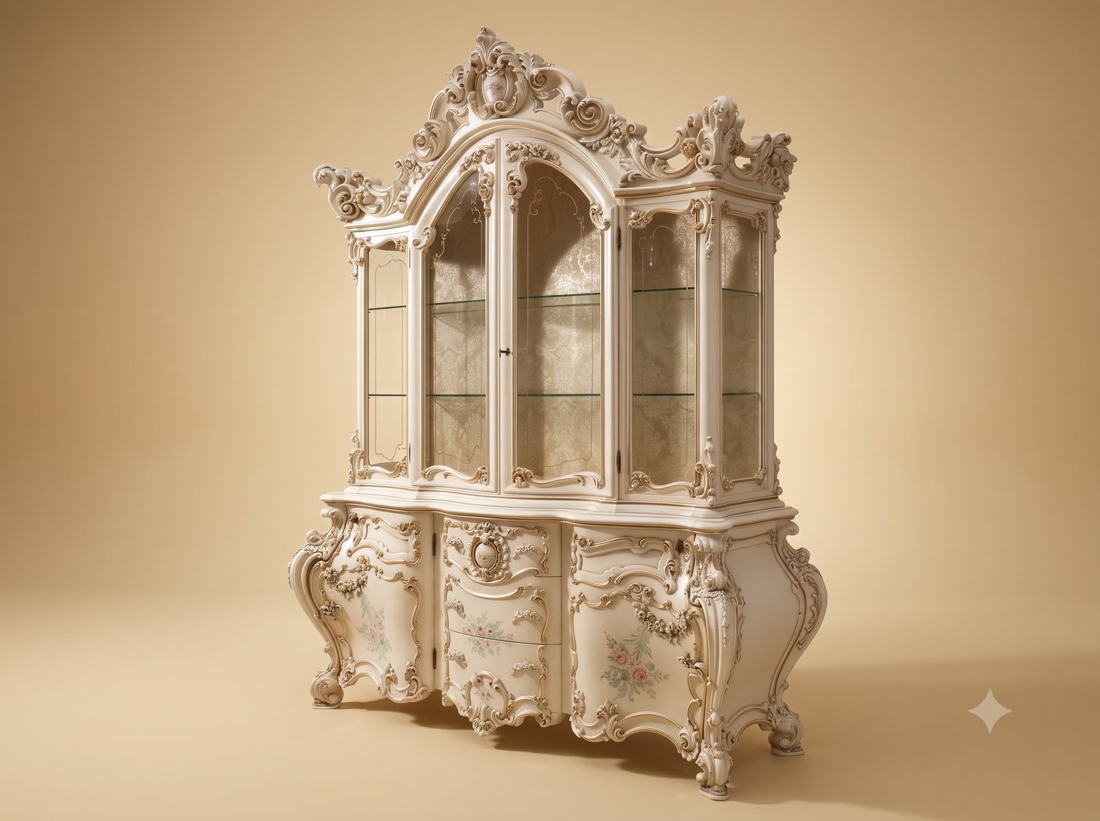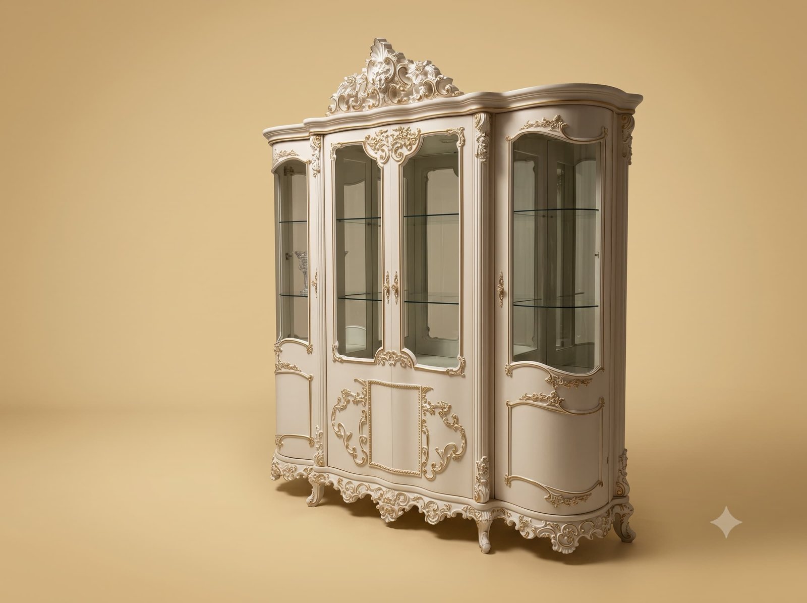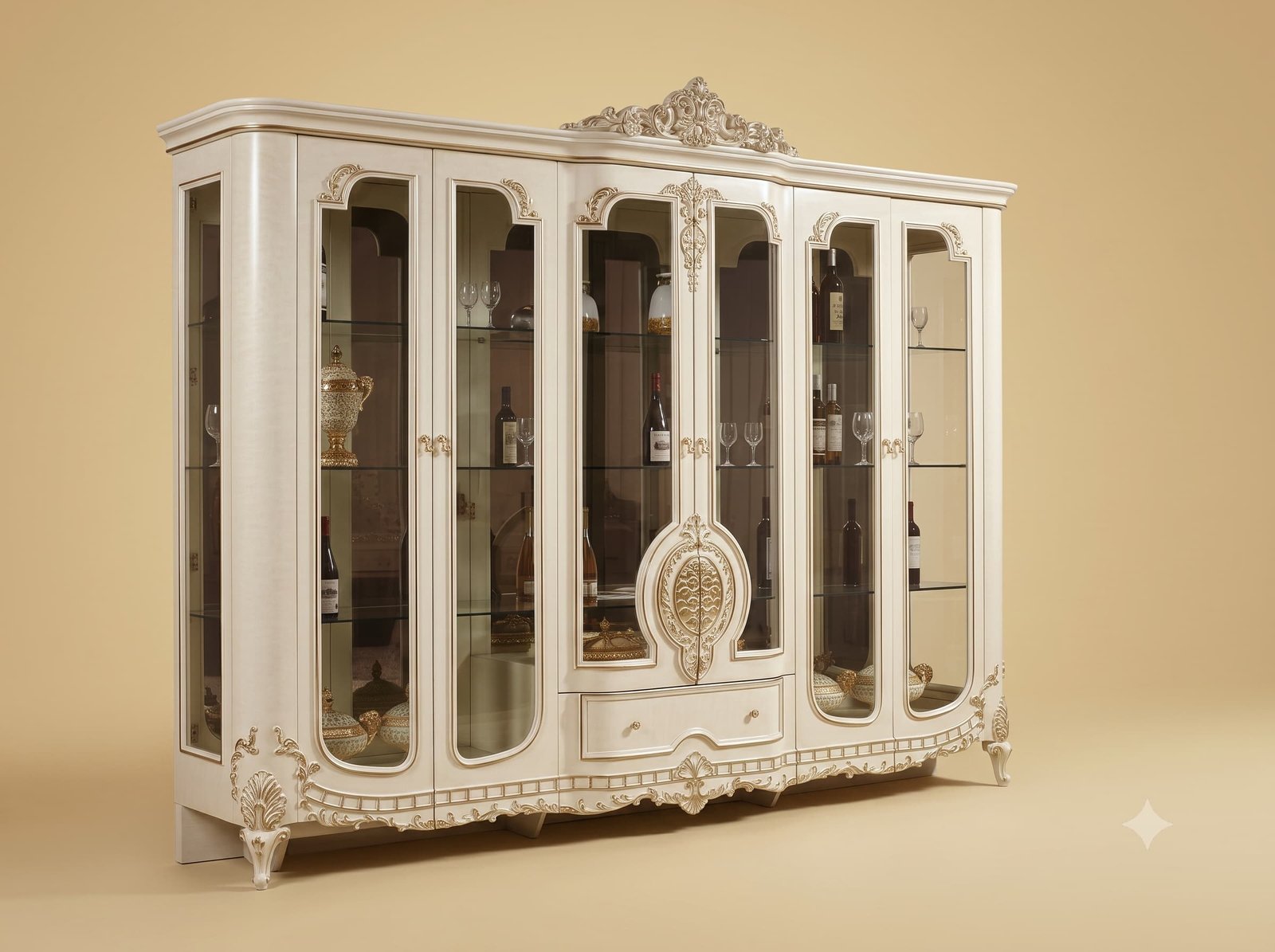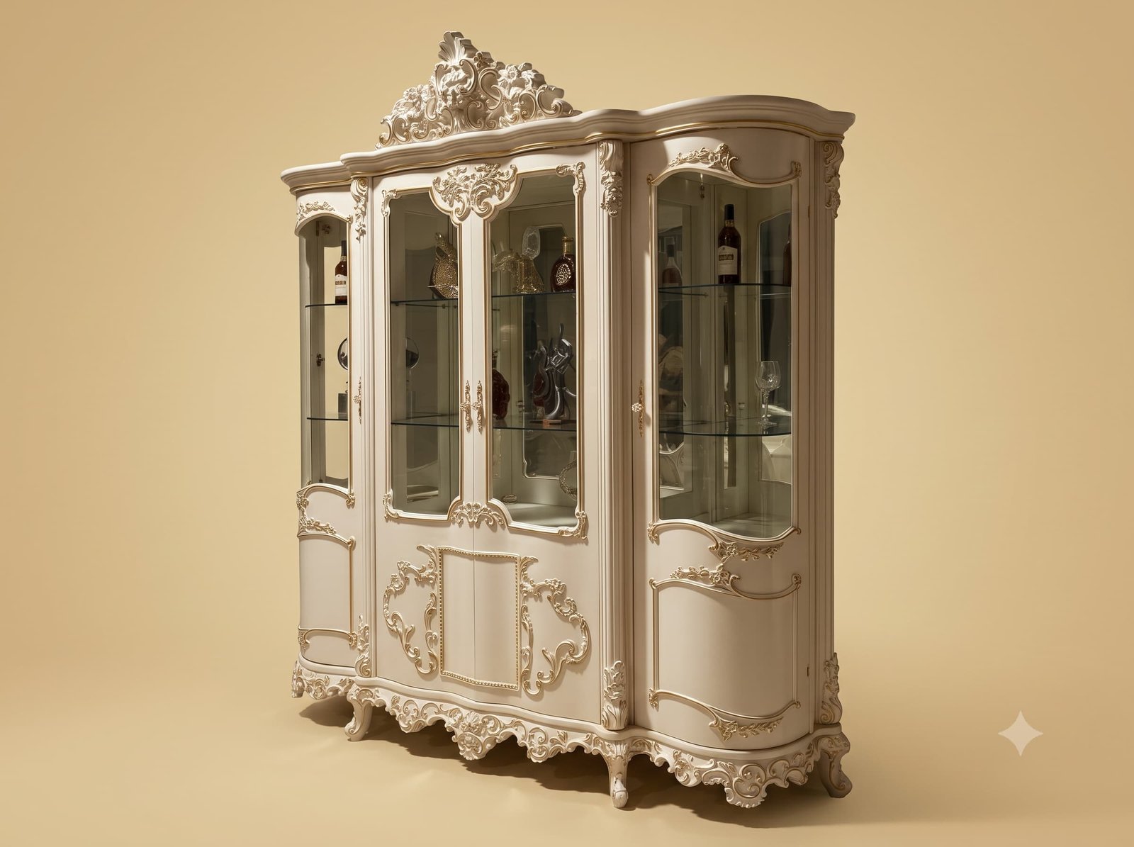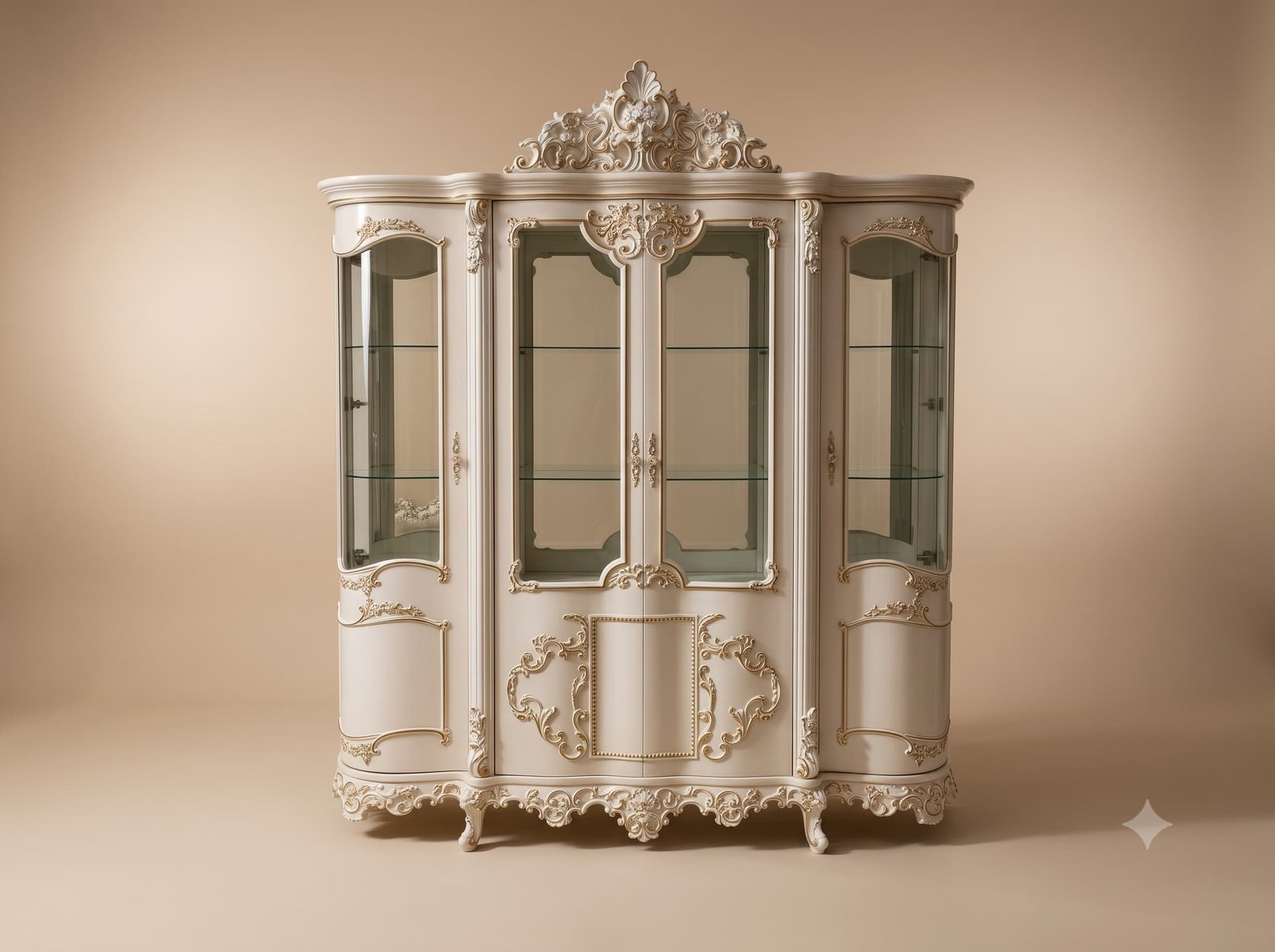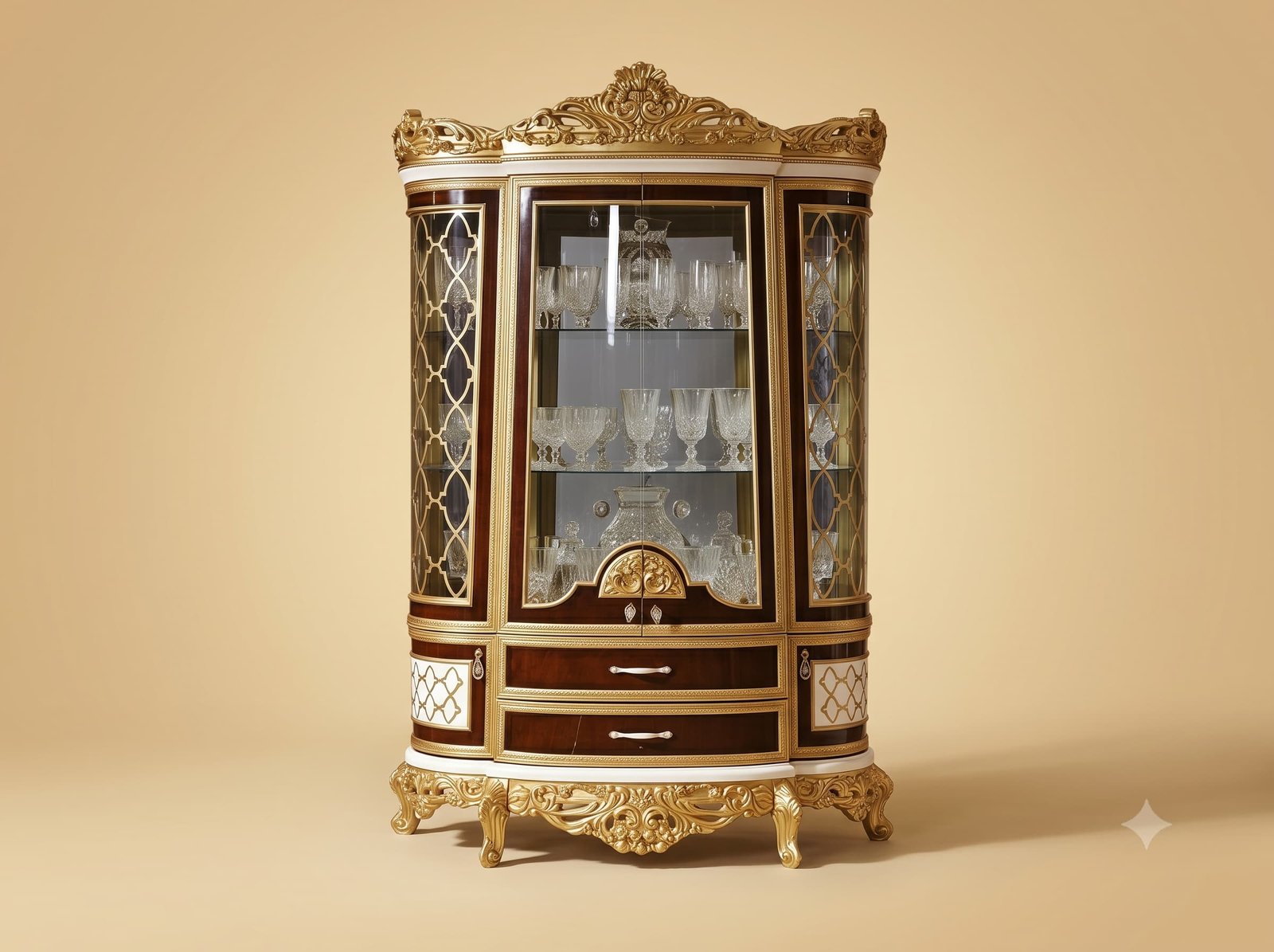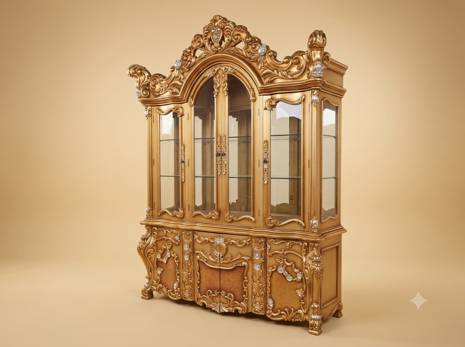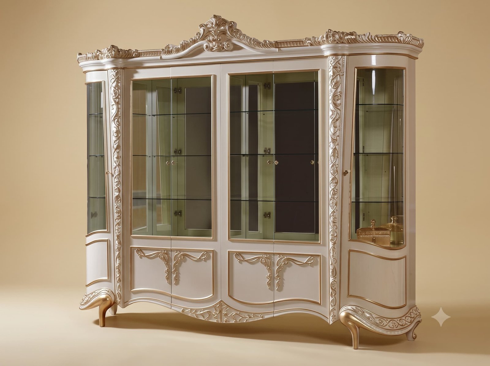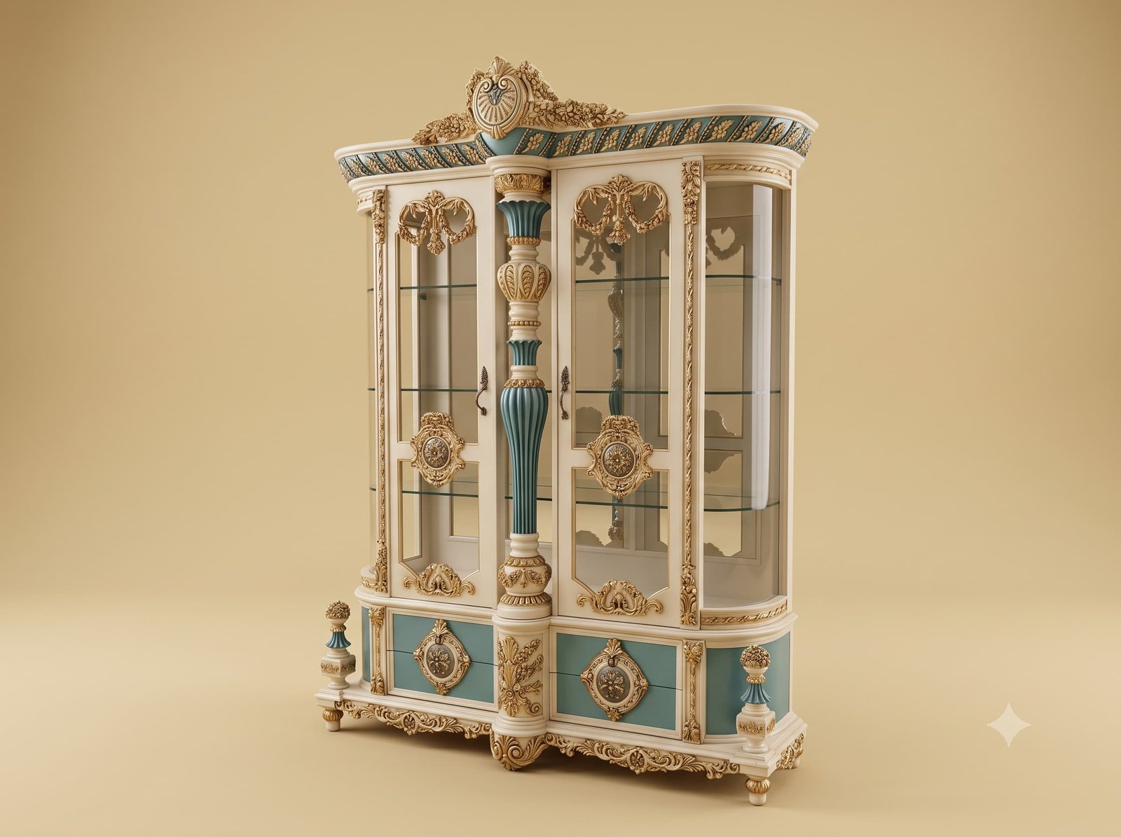
Strong colour on furniture follows one rule, and this cabinet is built on it: colour goes in, never out.
A saturated colour advances visually - it comes towards the eye and reads as nearer and larger than a pale one at the same distance. That is harmless on a flat wall. On furniture it is not, because a piece is made of members that project and members that recede, and the eye is already using light and shadow to judge which is which.
Put the teal on a projecting moulding and the moulding grows. It looks thicker than it is, the shadow beneath it stops reading as depth, and the whole cabinet gains visual weight without gaining a single millimetre.
So our master Indian artisans put the colour only where the surface is flat and recessed - the door panels, the drawer grounds, the frieze fields - and keep every cornice, moulding, bead, column and carved element in the pale tone. The colour sits back where it belongs, the pale mouldings read as edges catching light, and the cabinet stays as light as it looks in a drawing.
Reverse it and the same cabinet, in the same two colours, looks heavy. Nothing else changes.
 Ask Price On WhatsApp