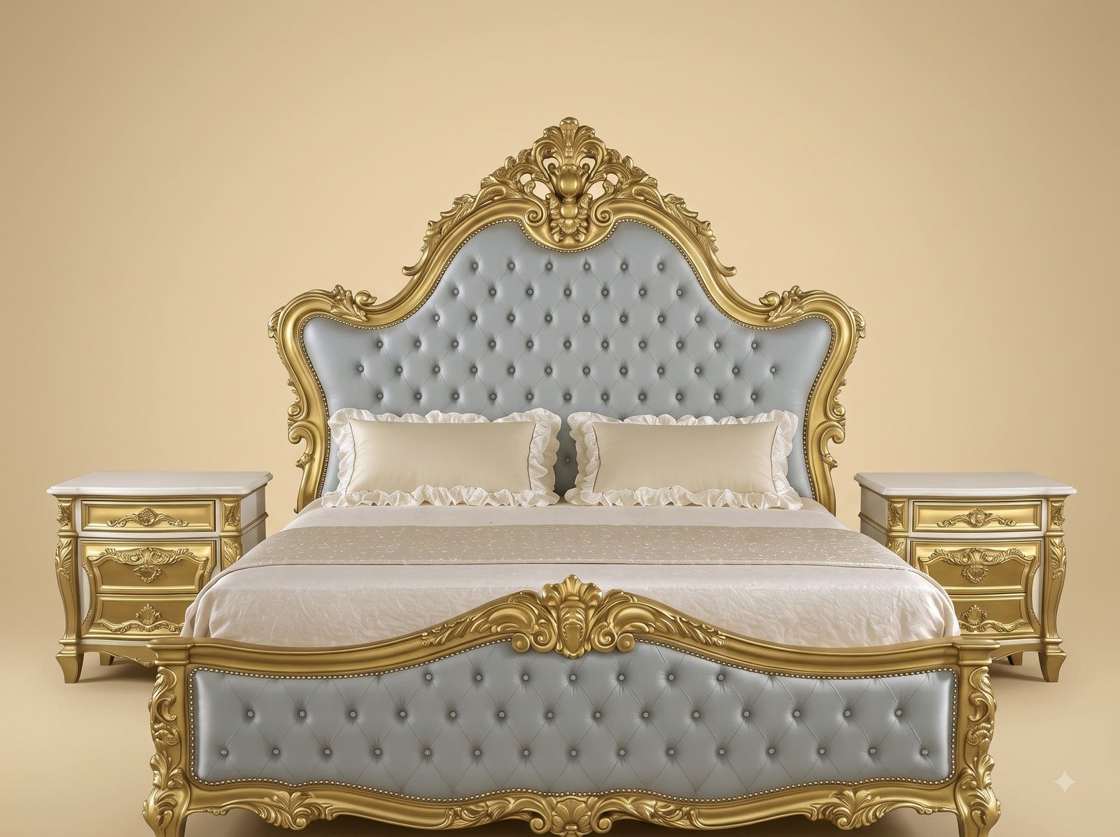
Choosing Grey to Make Gold Wearable
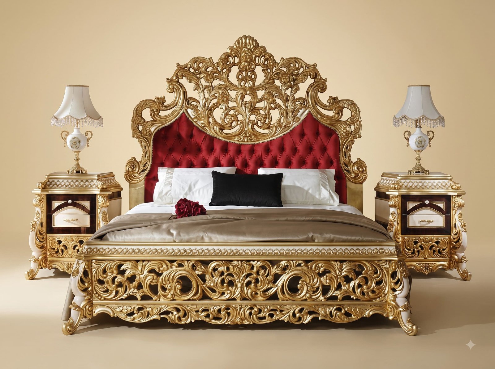
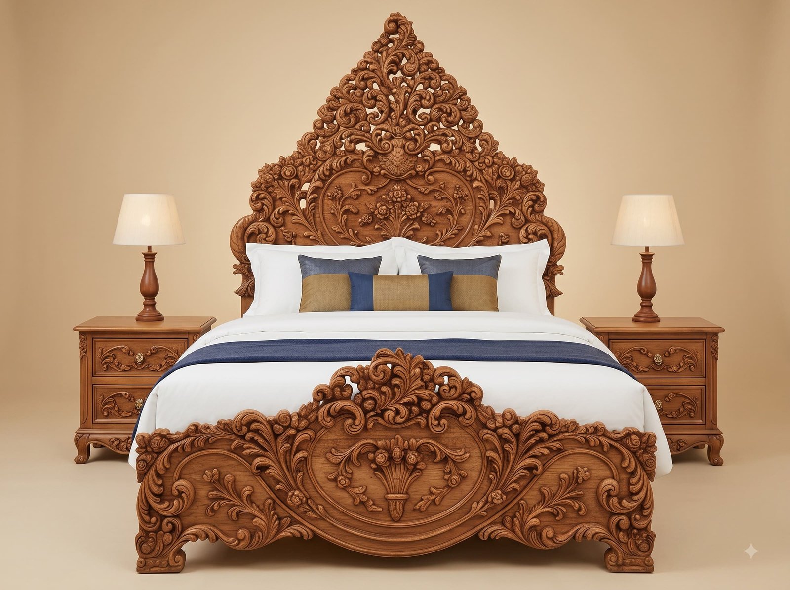
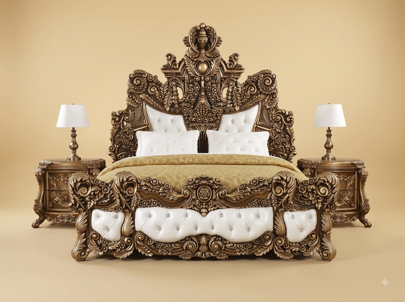
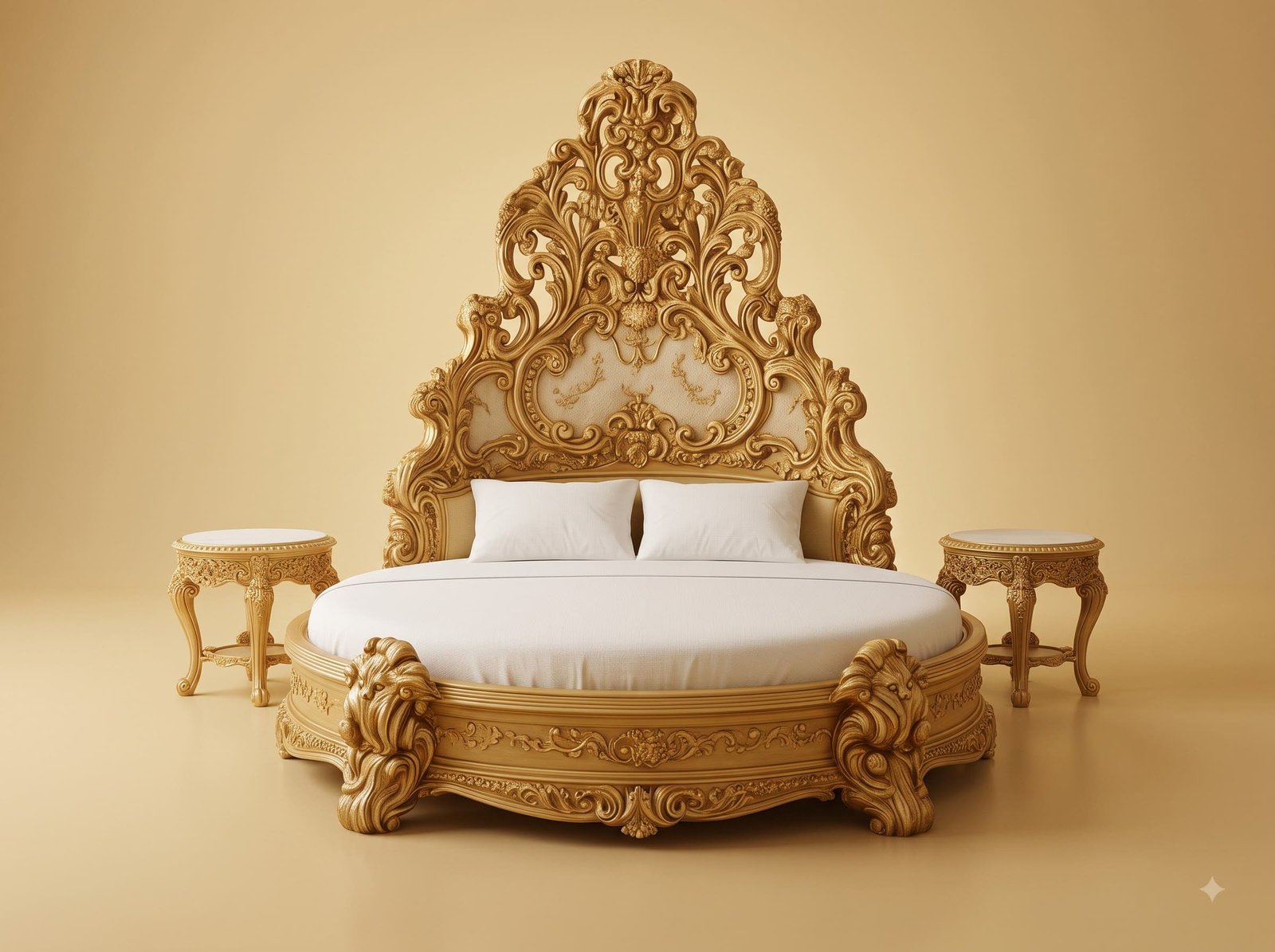
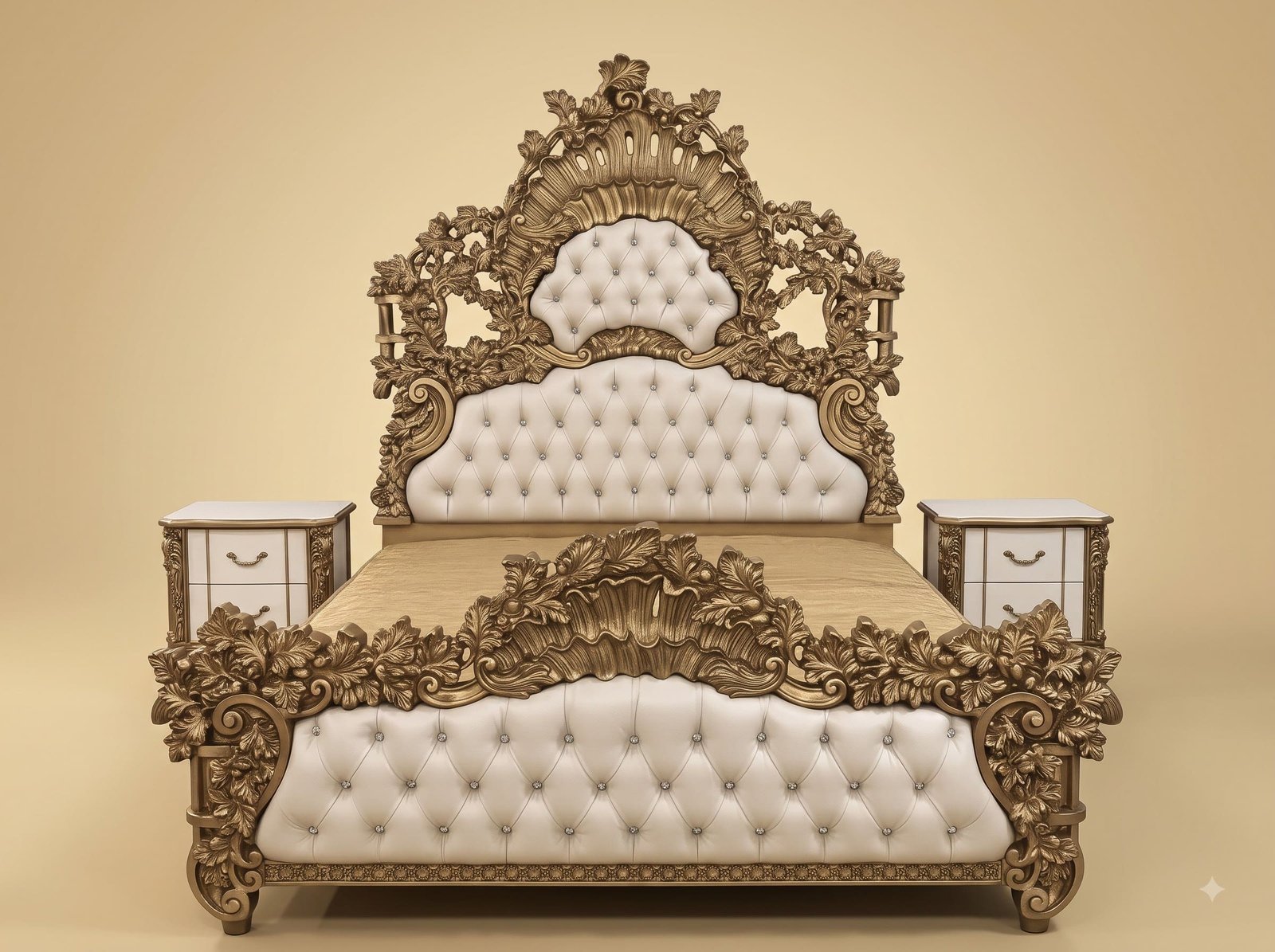
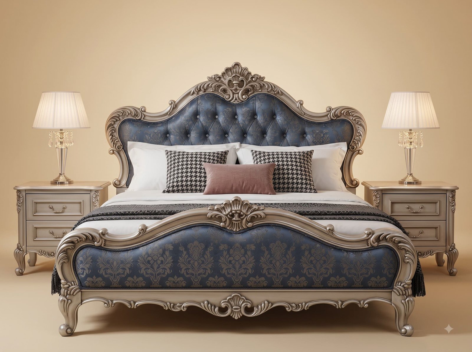
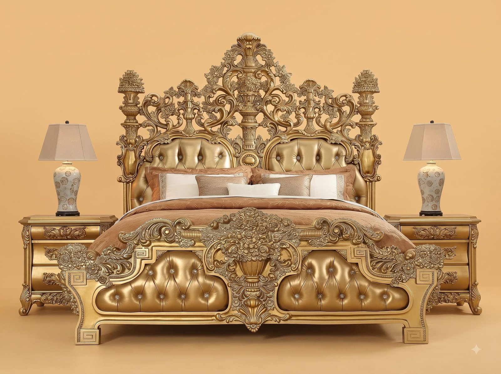
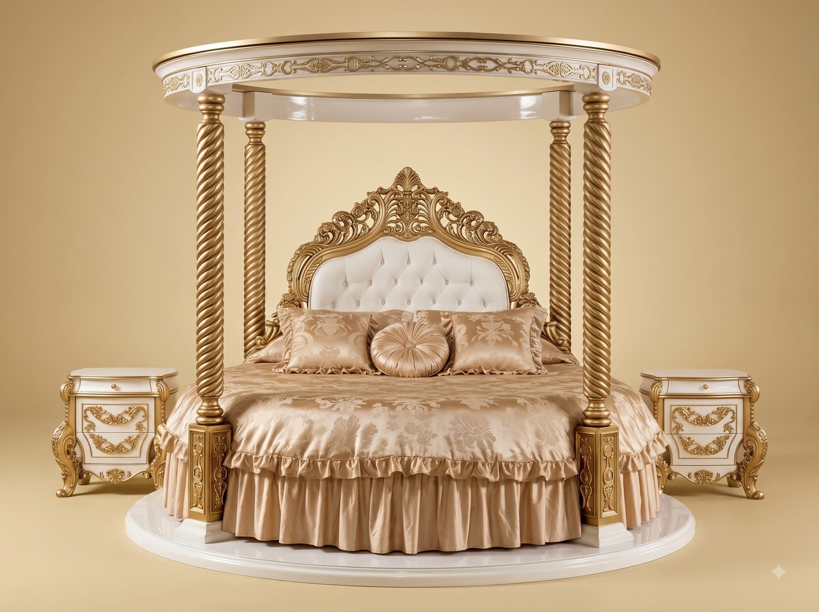
Most gold carved beds are upholstered in cream or white. It is the safe pairing and it is why so many of them look alike, and why so many of them look heavier in a real bedroom than they did in the showroom. Cream is a warm neutral; put it next to gold and every surface in the eye line is reflecting warm light back at you, which is fine at a distance and tiring in a room you sleep in. Grey is a cool neutral. It sits back, it takes light rather than throwing it, and the effect is that the carving on the frame becomes the object you look at instead of the whole bed being one bright mass.
The nailhead trim is the other quiet decision. Where a carved frame meets an upholstered panel there is always a line, and how that line is finished separates careful work from quick work. Piping hides it in fabric; a plain staple line leaves it raw. Here it is closed with individually set gold nailheads following every curve of the carved edge, including the tight reverse curves at the shoulders of the headboard where each nail has to be placed by eye. It is slow, and it is the reason the join looks intentional rather than covered up. All of this is handwork by master Indian artisans, and the photographs show the actual piece.
 Ask Price On WhatsApp