Why Black Velvet and Not Black Leather
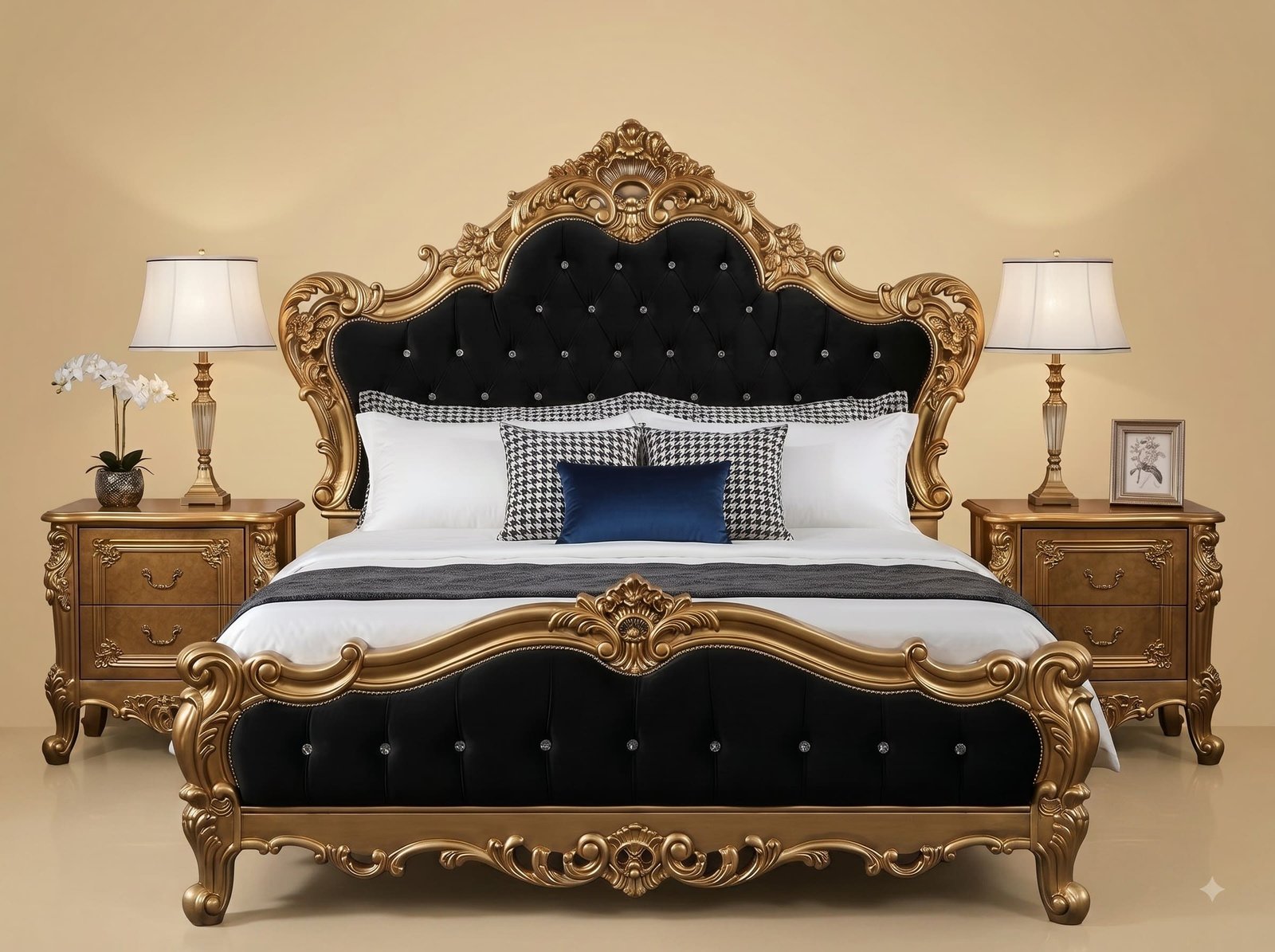
Black is the most demanding colour to upholster a large panel in, because black absorbs light and a big absorbing surface reads as a hole rather than as a material. Black leather makes that worse: it is smooth, so it reflects light in one hard specular line and stays flat everywhere else. Velvet solves the problem physically. Its pile stands up from the backing, and light entering at an angle scatters off the fibre ends, so the panel shifts between charcoal, near-black and a soft sheen depending on where you stand and where the lamps are. On a bed, where you approach from a doorway and then sit beside it, that change is the difference between a panel with depth and a panel with none.
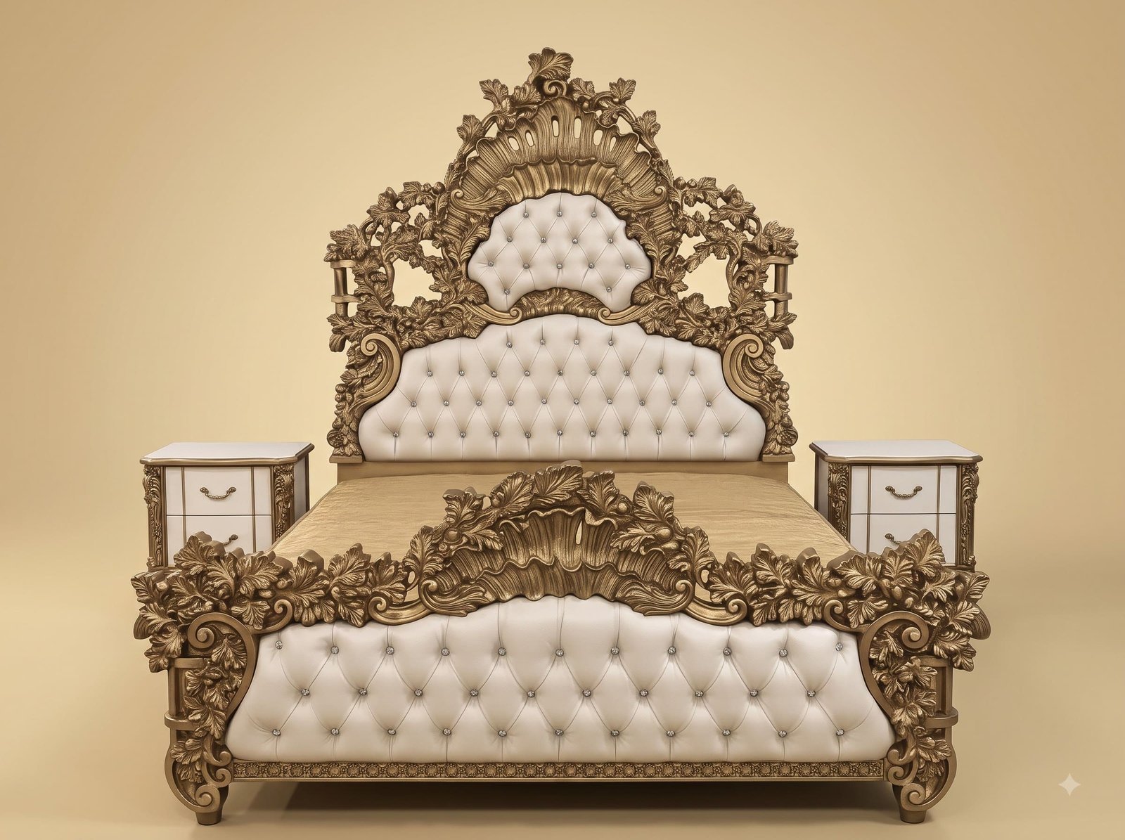
The gold was aged for the same reason. Bright gold against black is a maximum-contrast pairing and it can tip into looking hard rather than deep. Working the finish darker in the recesses and burnishing it back only on the raised carving keeps a gradient across every scroll, so the frame reads as modelled rather than outlined. Setting crystal buttons rather than fabric-covered ones was the last decision: on a black panel, a covered button disappears and the tufting geometry vanishes with it. Master Indian artisans carve, finish and upholster each of these by hand, and the images here are of the actual bed.
 Ask Price On WhatsApp